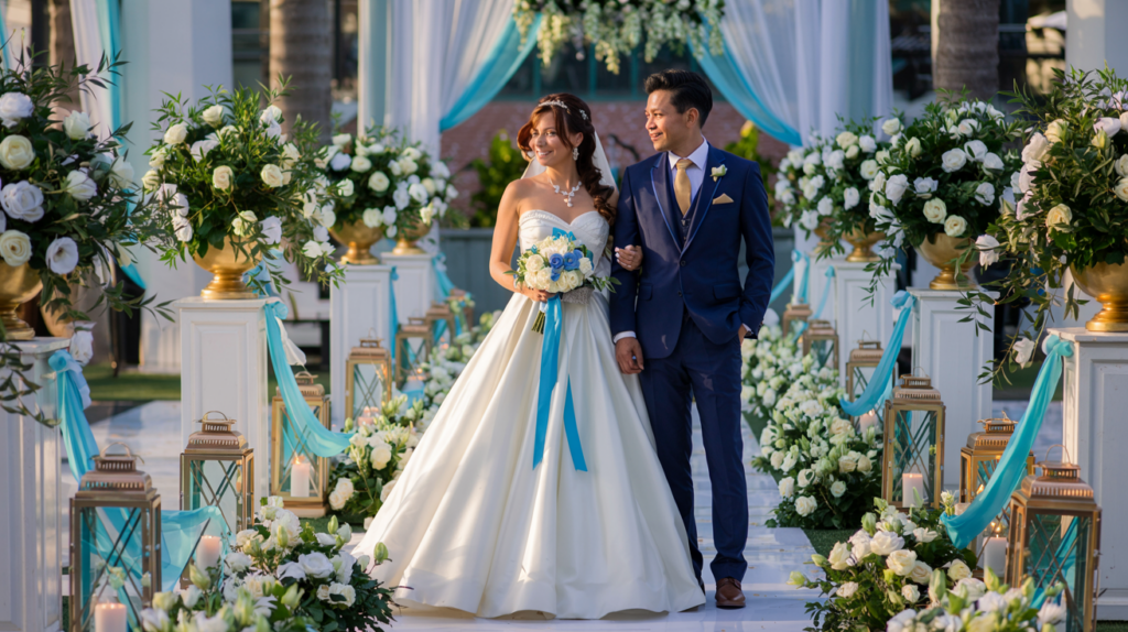
Key points
- Soft pastels for spring feel fresh and new. Bold jewel tones in winter add warmth to cold days.
- One main color, one support color, and one accent color keep things simple but interesting.
- Classic color pairs like navy and blush or black and white never go out of style.
Contents
- 1 Key points
- 2 Understanding the importance of color in wedding planning
- 3 How color schemes reflect personal style and theme
- 4 Choosing the Right Color Palette
- 5 Popular Wedding Color Combinations
- 6 Incorporating Colors into Wedding Elements
- 7 Cultural and Regional Color Influences
- 8 Expert Tips for Perfect Color Coordination
- 9 Frequently Asked Questions (FAQ)
Understanding the importance of color in wedding planning
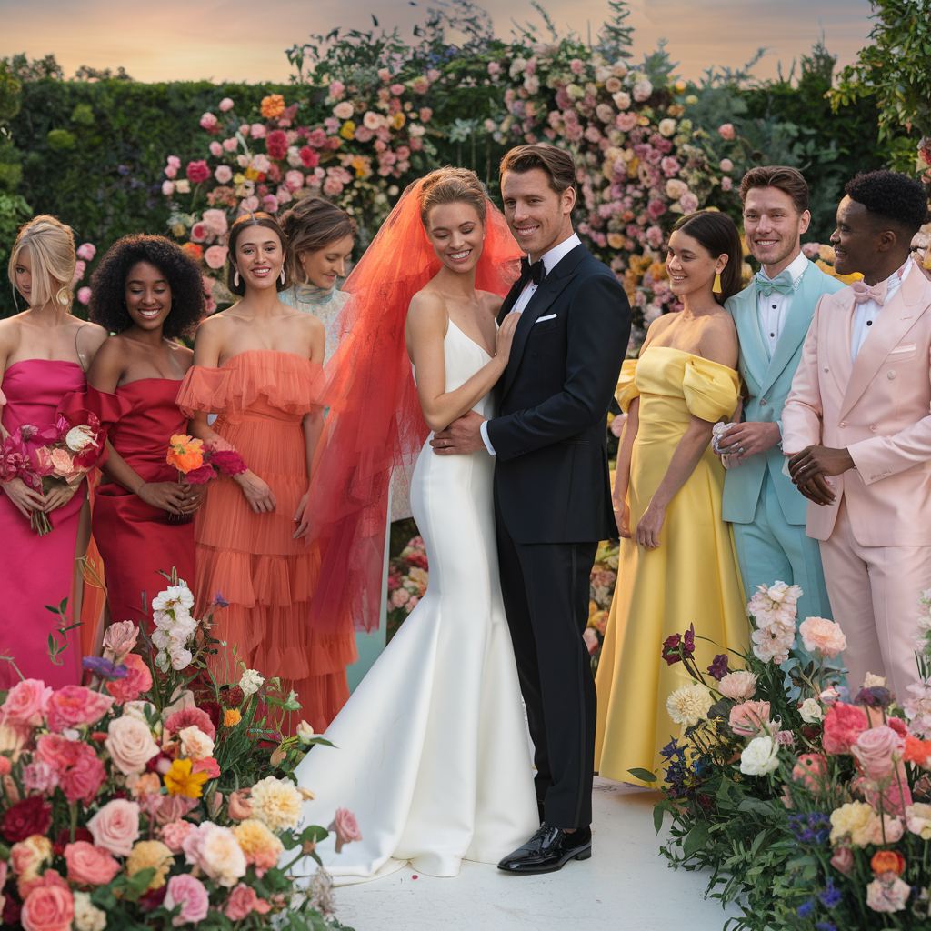
Colors do more than just look nice – they create a feel during the wedding. Bright colors like fiery red and orange can make things feel fun while soft colors like baby blue or pink feel chill and romantic.
Colors also help with the practical side of planning. It makes select things easier like:
- Bridesmaid dresses
- Table settings
- Flowers
- Invitations
How color schemes reflect personal style and theme
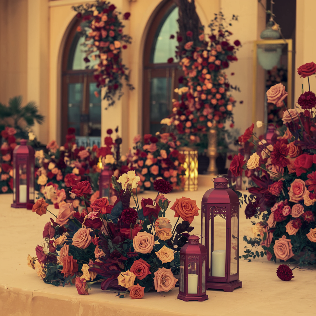
Wedding colors say a lot about the couple. They’re like a peek into their personalities. Bright and bold colors might show their fun and outgoing personality while light and soft colors can show their traditional sides.
Colors can also connect to the wedding theme. Beach weddings often use blues and sandy colors Fall weddings might use orange, red, and brown. Winter weddings often have silvers, blues, and whites.
But you don’t have to follow those rules if you don’t want to. More couples are breaking the rules now by using different colors. The color combination you select should make you happy whenever you see it.
Choosing the Right Color Palette
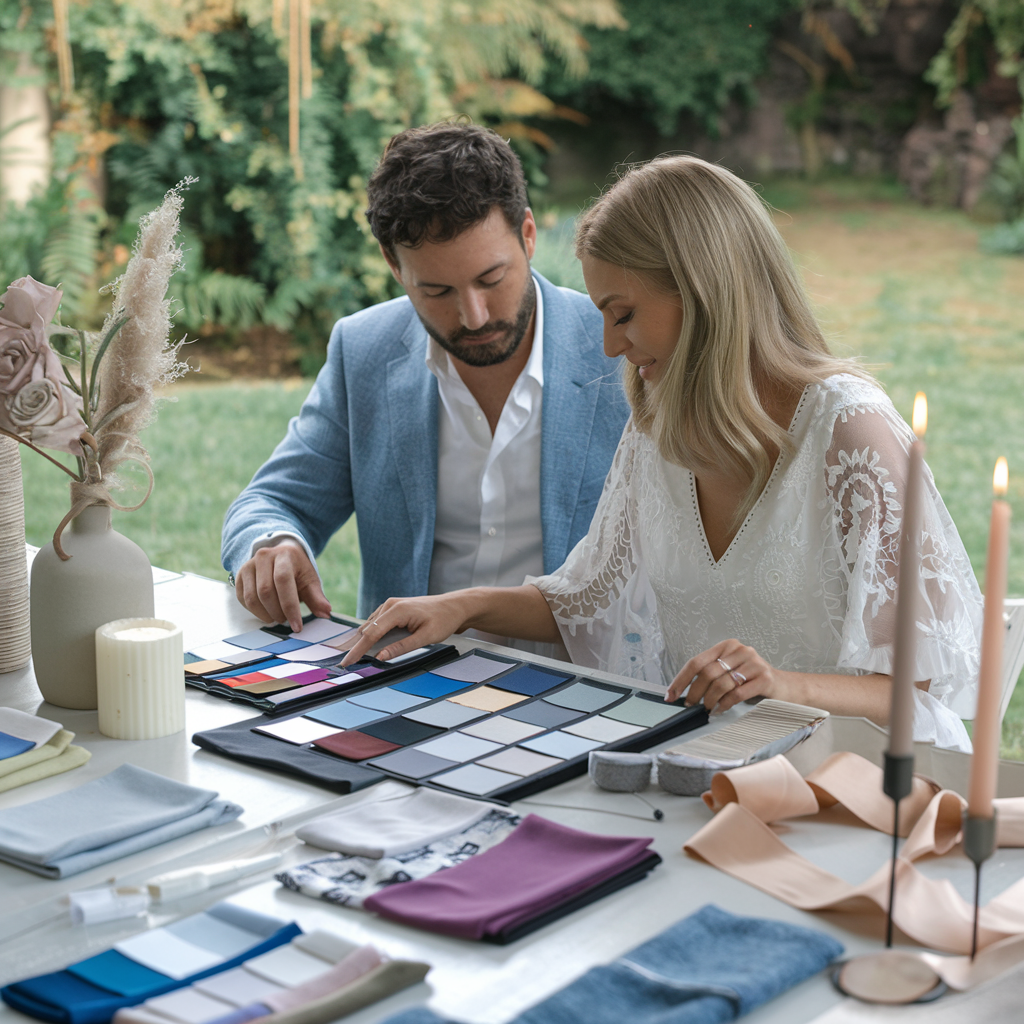
Colors can make and ruin the whole experience. Gravitate towards the colors you choose for your wedding. That’s the first step is always picking colors that make you happy. It should be a reflection of you (as a couple) not a replica of someone else’s wedding.
Colors tell a story and set the mood. Guests can tell what sort of celebration it will be like even before they sit down. Think about it: deep burgundy and gold feel different from light blue and peach. One feels rich and warm while the other feels light and fresh.
Think about factors such as the season, the venue, and the mood
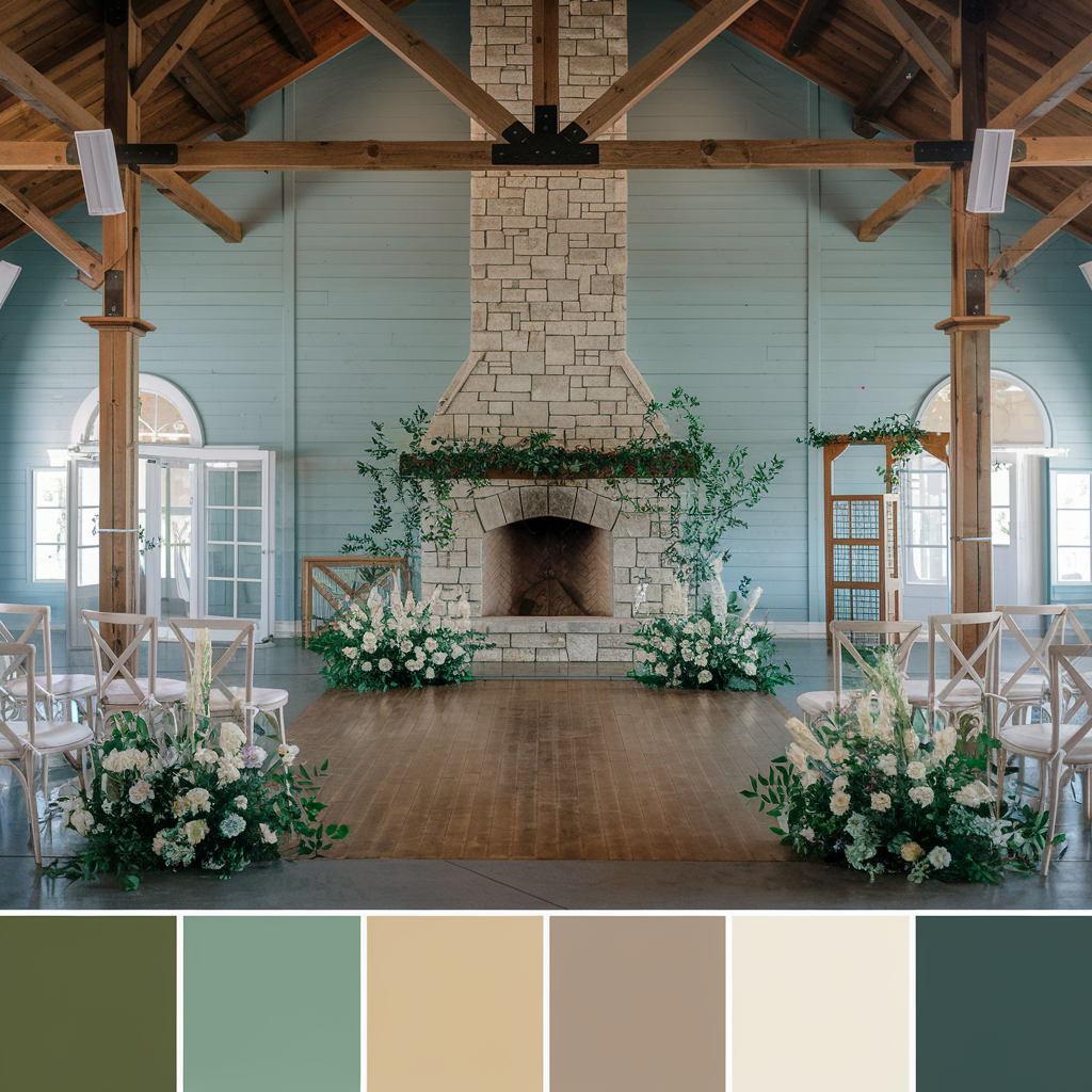
Seasons matter a lot when picking the wedding colors.
Winter
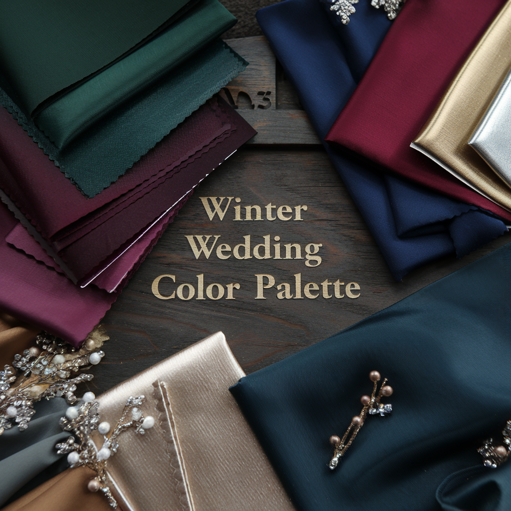
A winter wedding should have dark green colors, burgundies and wines, navy colors, and metallics. Summer loves bright colors like coral or turquoise The colors for fall are burnt orange, deep reds, and mustard yellow. Spring matches well with pastels and fresh greens.
Beach
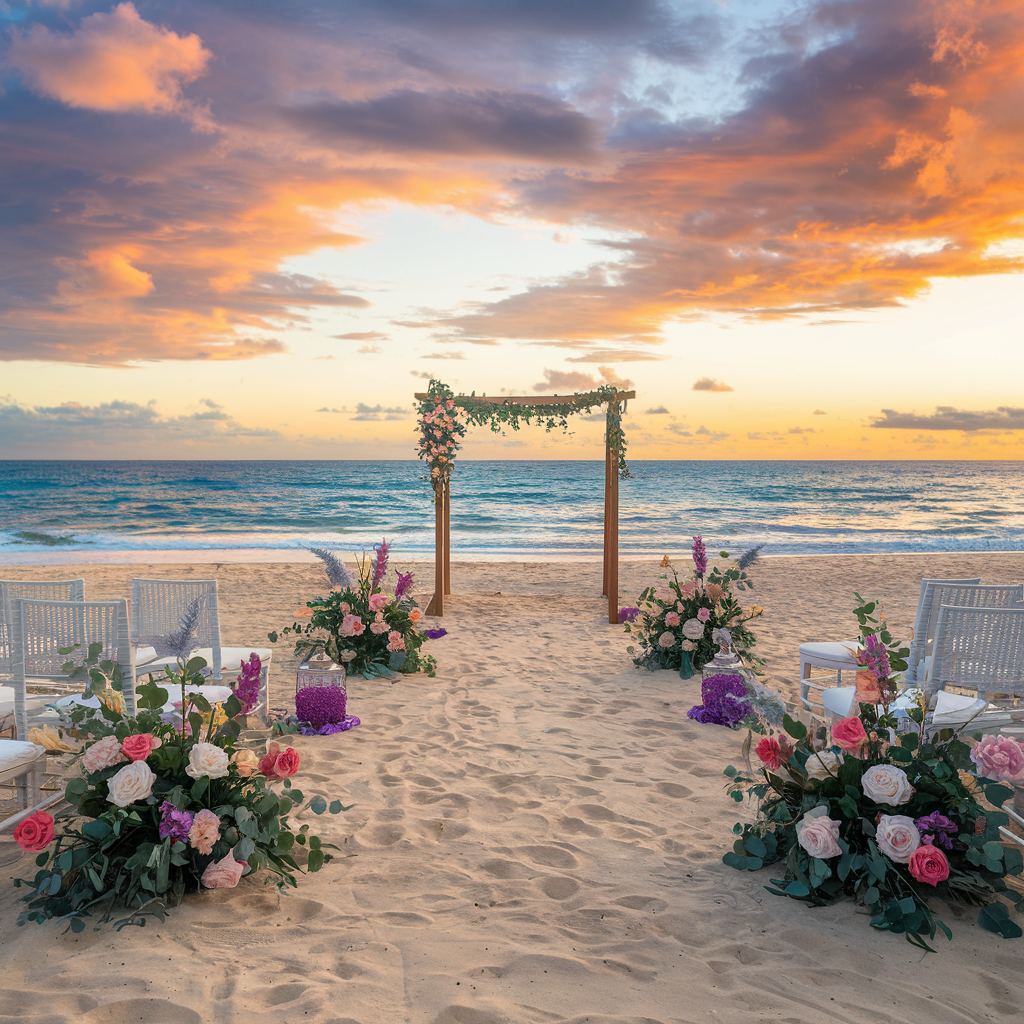
Venue is super important too. A beach wedding that had purple and silver will look weird and clash with the sand and the ocean. The colors should work with the setting instead of fighting against it.
Contrasting Colors
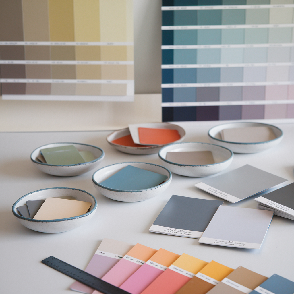
Think about the mood you want. Want a party feeling? Go bold with contrasting colors. Want something romantic? Soft and muted colors create that dreamy feel. Want elegant? Using one or two colors in different shades produces a super classy effect.
How to balance colors for a cohesive look
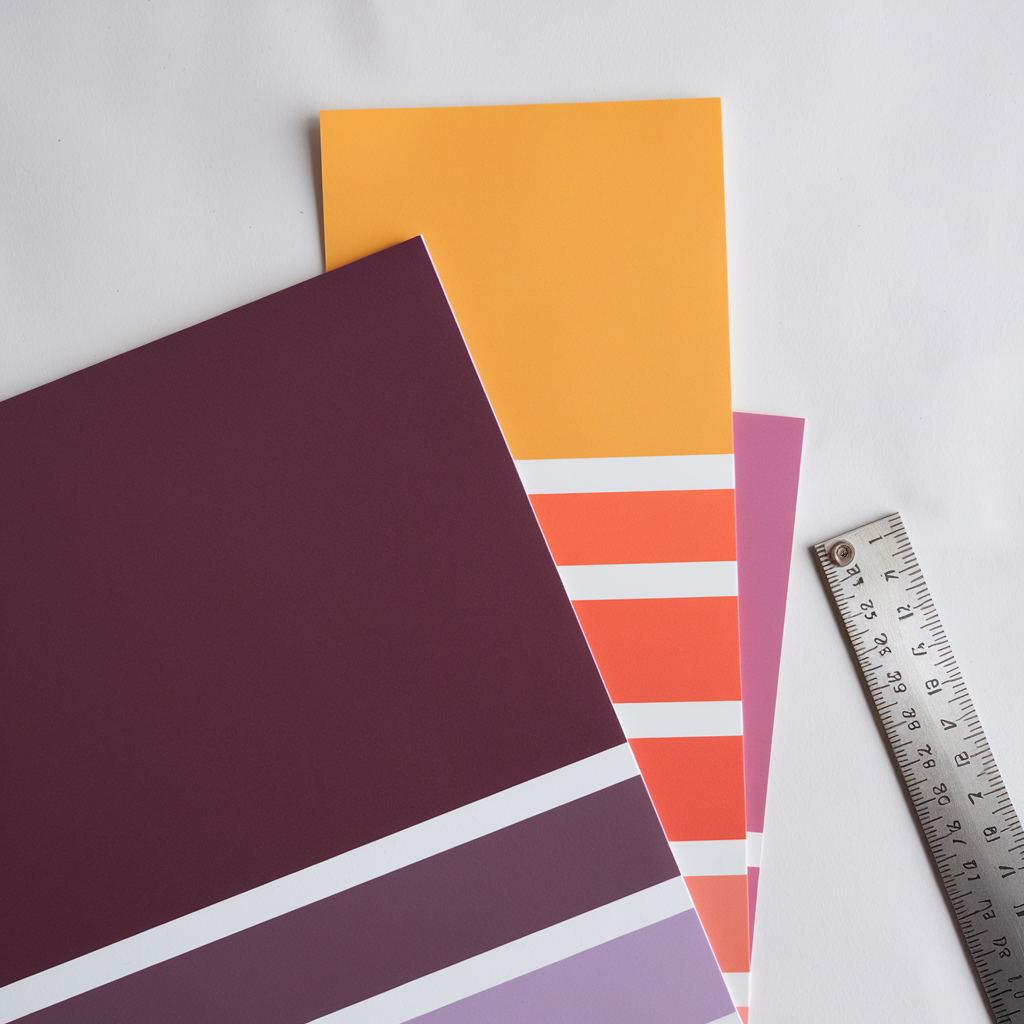
Balance is key. Too many colors make things look messy. So it is suggested to have a maximum of three colors: a main color, a complementary color, and an accent.
Primary Color
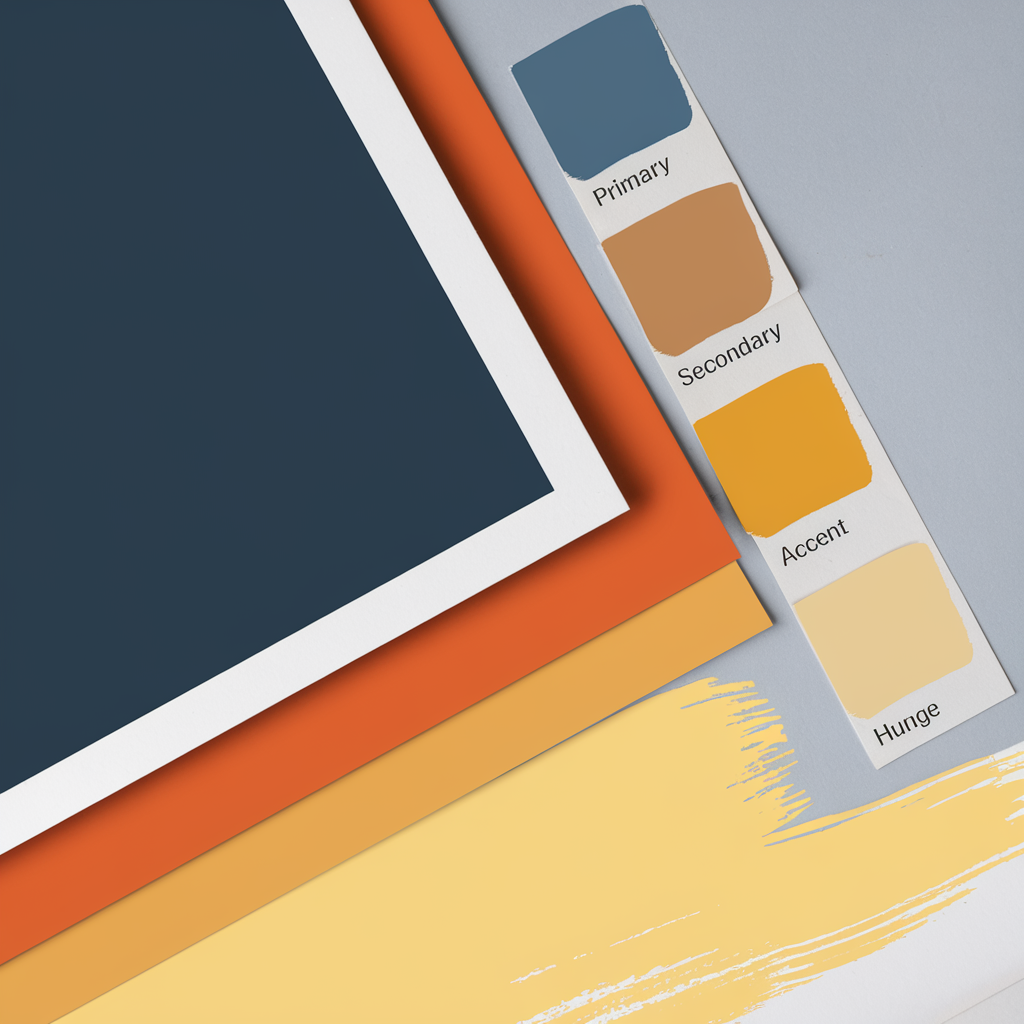
Try incorporating a primary color, a second complementary, and a third accent. This will look put together without being boring.
60-30-10 Rule
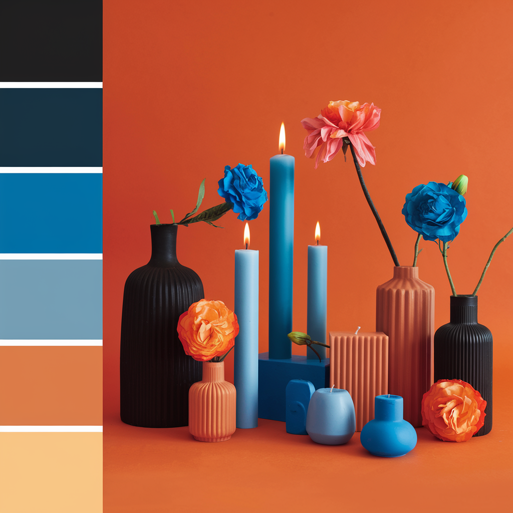
The 60-30-10 rule works great for weddings. Try to use the main color for about 60% of things like bridesmaid dresses and tablecloths. Incorporate the second color in 30% of elements for things like napkins or utensils. Use the accent color for 10% like ribbons and a small décor item.
Testing your colors together is so important. Have time to try fabric swatches, paint chips, or create a board to test how the colors look together.
Remember that colors will be in the photos forever. Wearing bright colors can sometimes result in odd or overwhelming appearances in pictures. Always consult with the photographer on colors that look good together.
Popular Wedding Color Combinations
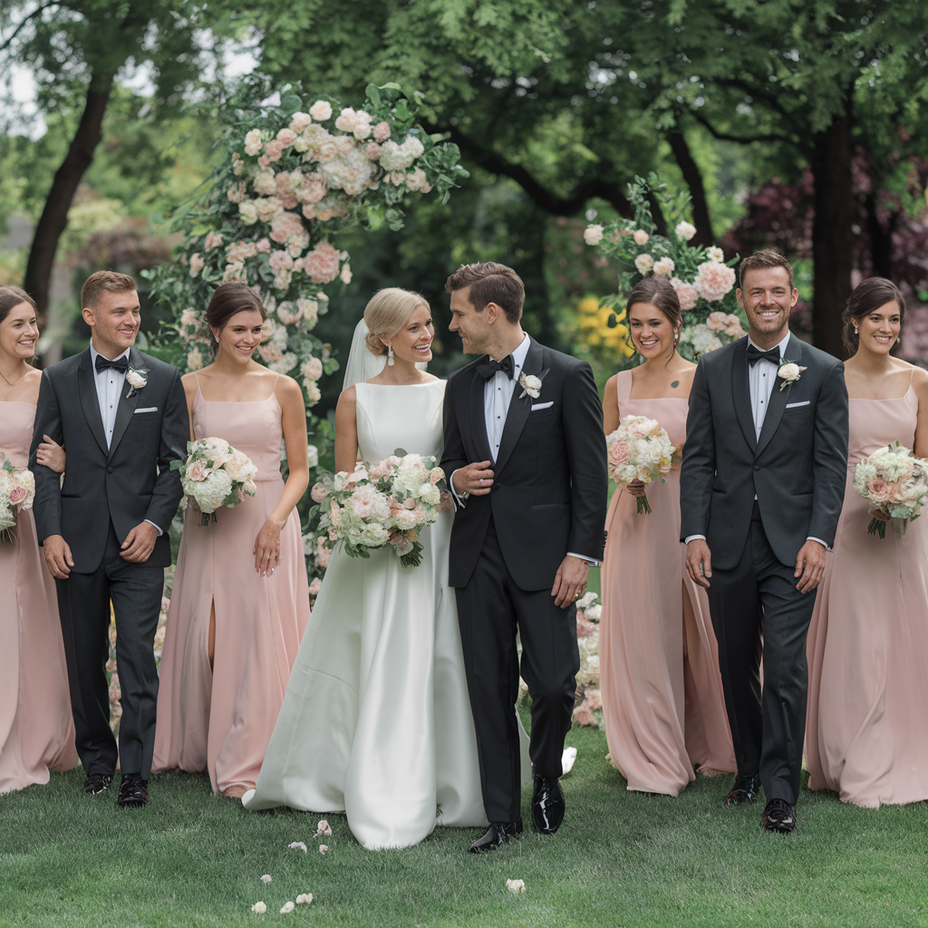
Wedding colors come and go over the years but some colors stick around because they match so well. Here are some colors that work best for most couples:
Classic color pairings and their symbolism
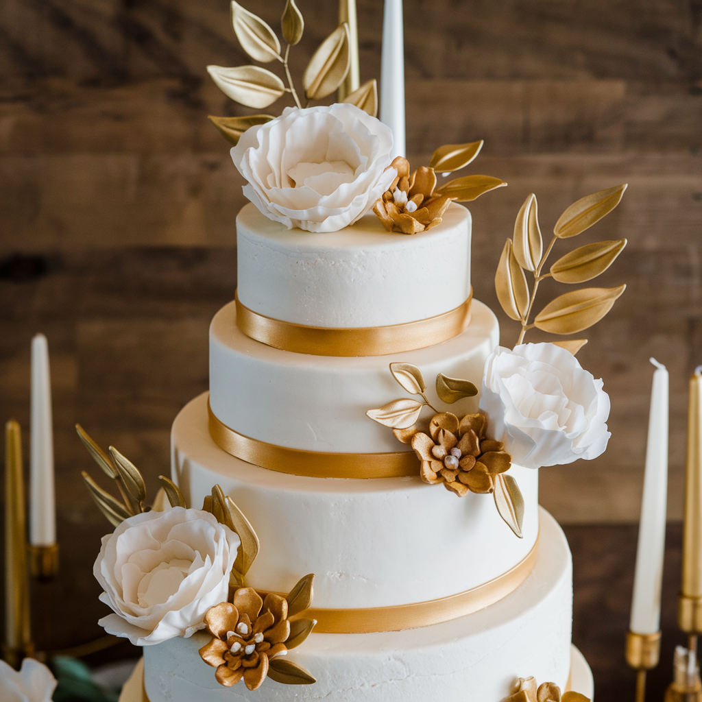
White and gold never go out of style. White means purity while gold shows wealth and joy. Many church weddings use these colors as an ideal option for religious weddings.
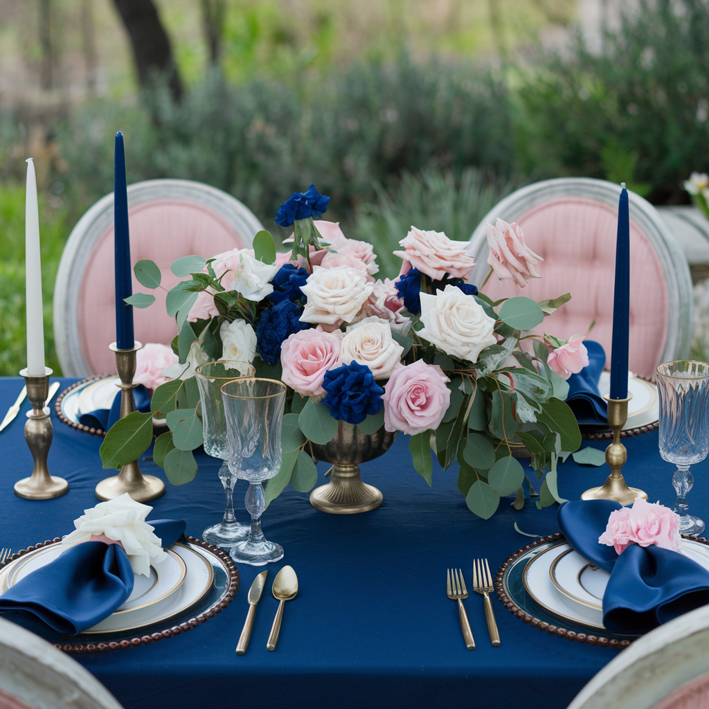
Navy and blush pink work well together. A trust and calm feeling from navy while pink adds romance. This mix fits formal and casual weddings alike.
Black and white
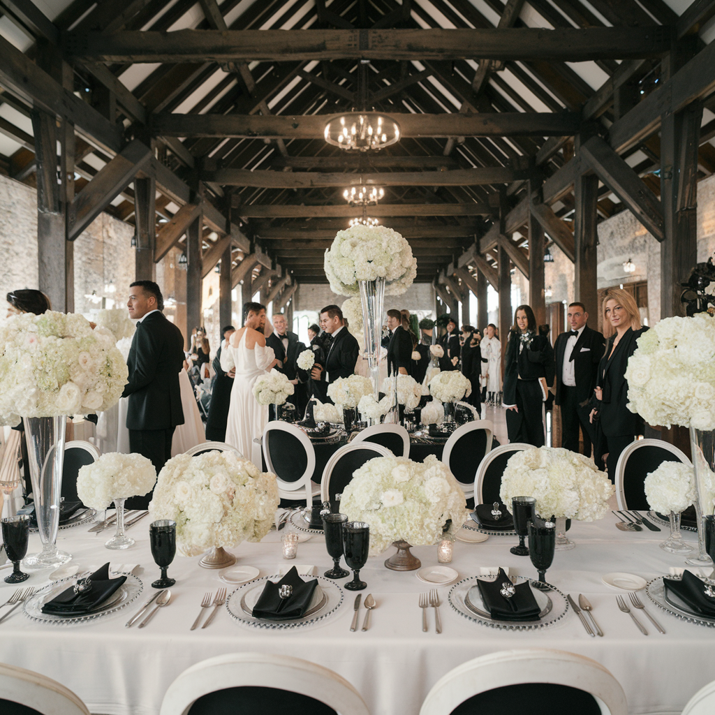
Black and white is a timeless duo. These colors mean elegance and class that makes a beautiful contrast in photographs and work for all seasons.
Trendy color palettes for modern weddings
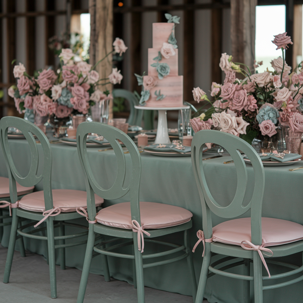
Sage green and dusty rose top the charts now. These earth tones create a calm and natural feel that works best for outdoor or rustic weddings.
Terracotta and cream
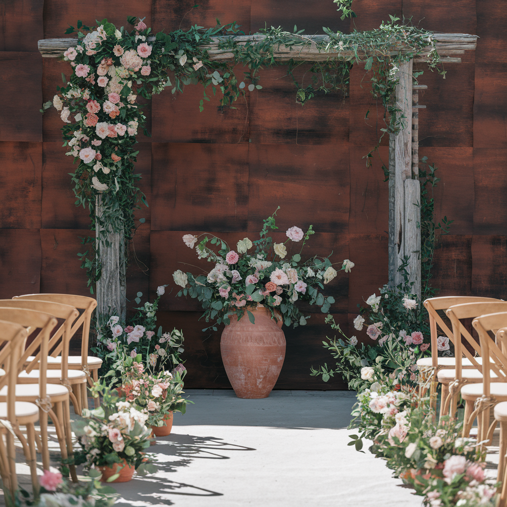
Terracotta and cream have gained huge popularity. Darker warm colors feel desert or bohemian vibes and they look amazing at fall weddings.
Lavender and silver
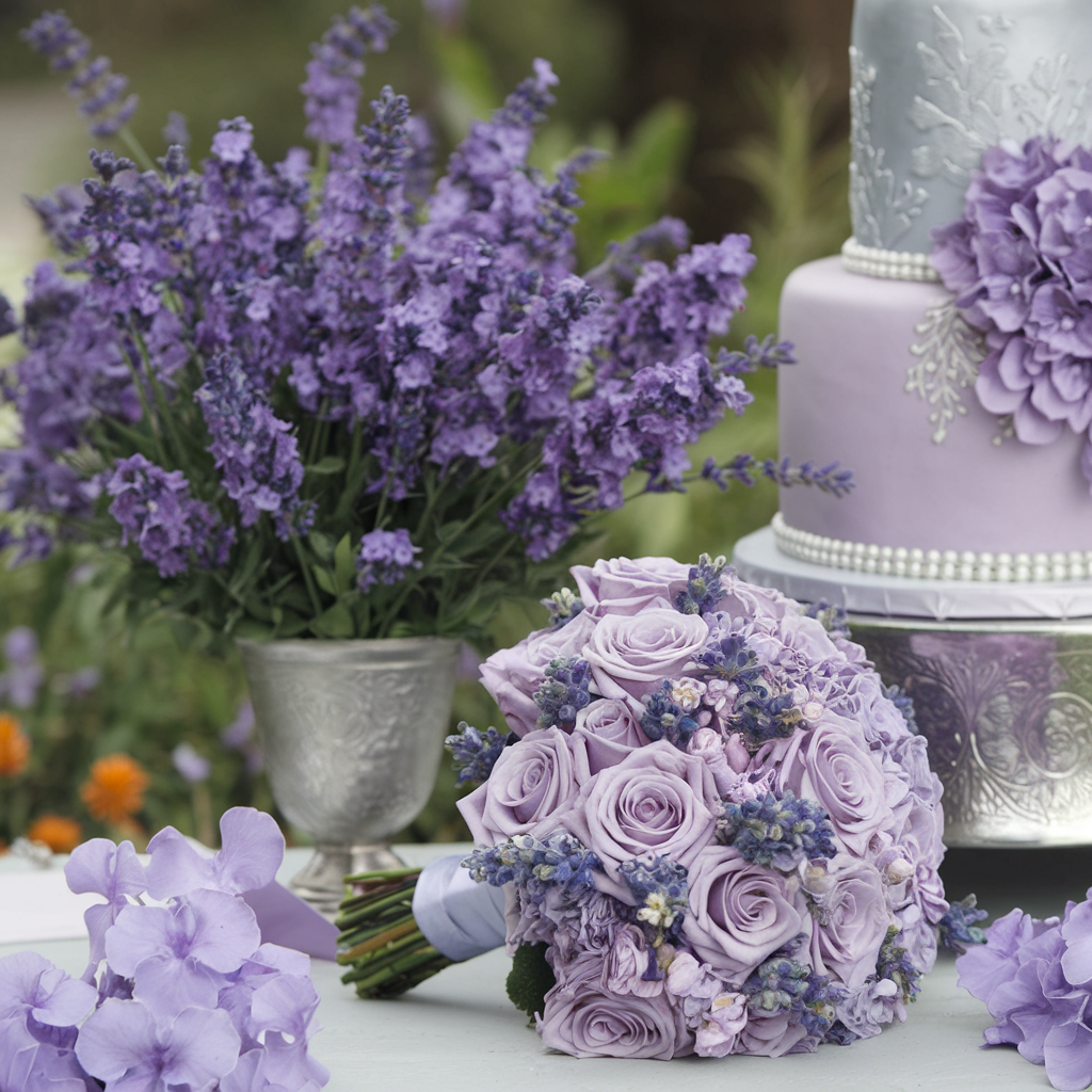
Lavender and silver make a fresh combo for spring. Lavender gives a feeling of calmness while silver exudes a modern touch. This pair works well for garden settings
When choosing colors – consider the space where the ceremony and reception will be held, the season, and what feels best for you. The greatest combinations stay true to you as a couple while creating the atmosphere you want for your guests.
Incorporating Colors into Wedding Elements
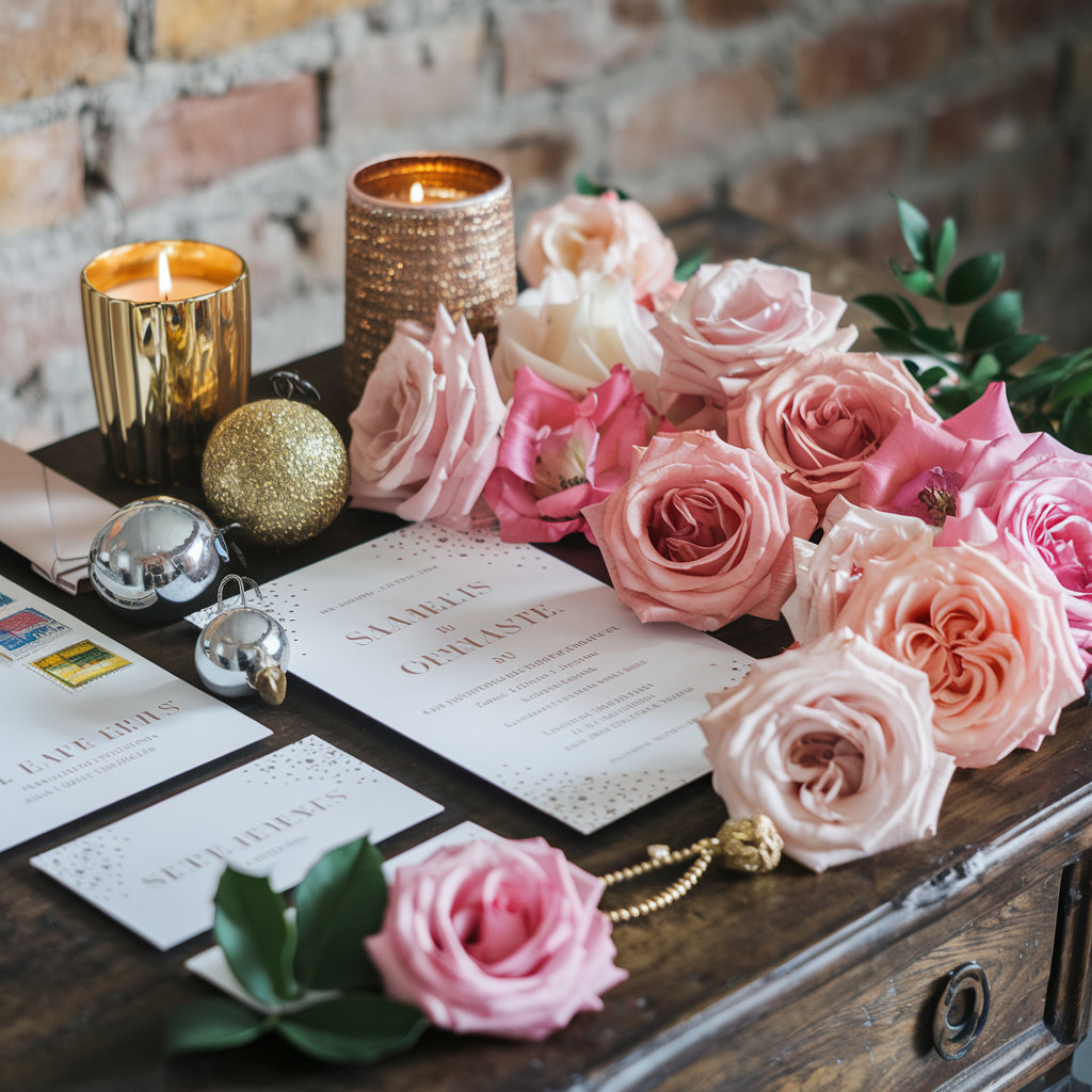
Colors make weddings special as they set the mood for the whole day.
Think about what you like. Bold or soft vibe? Dark or light? Pick colors that make you happy. Colors can be found everywhere – from all the paper things to flowers to what people wear.
Using colors in invitations and stationery
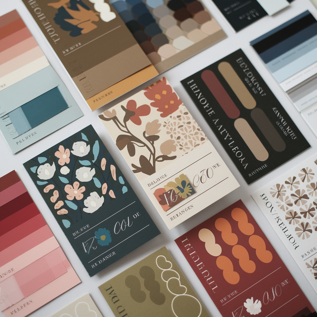
Wedding invites don’t only convey the details of the wedding.
Ways to use color in printed wedding materials:
- Colored paper for invites.
- Colored ink for words.
- Envelopes in your colors.
- Wax seals that match.
- Adding color to the edges of cards.
- Don’t go crazy with too many colors. Pick 2-3 main ones.
- Stationery should match the wedding colors to tie everything together.
Integrating color into floral arrangements and decor
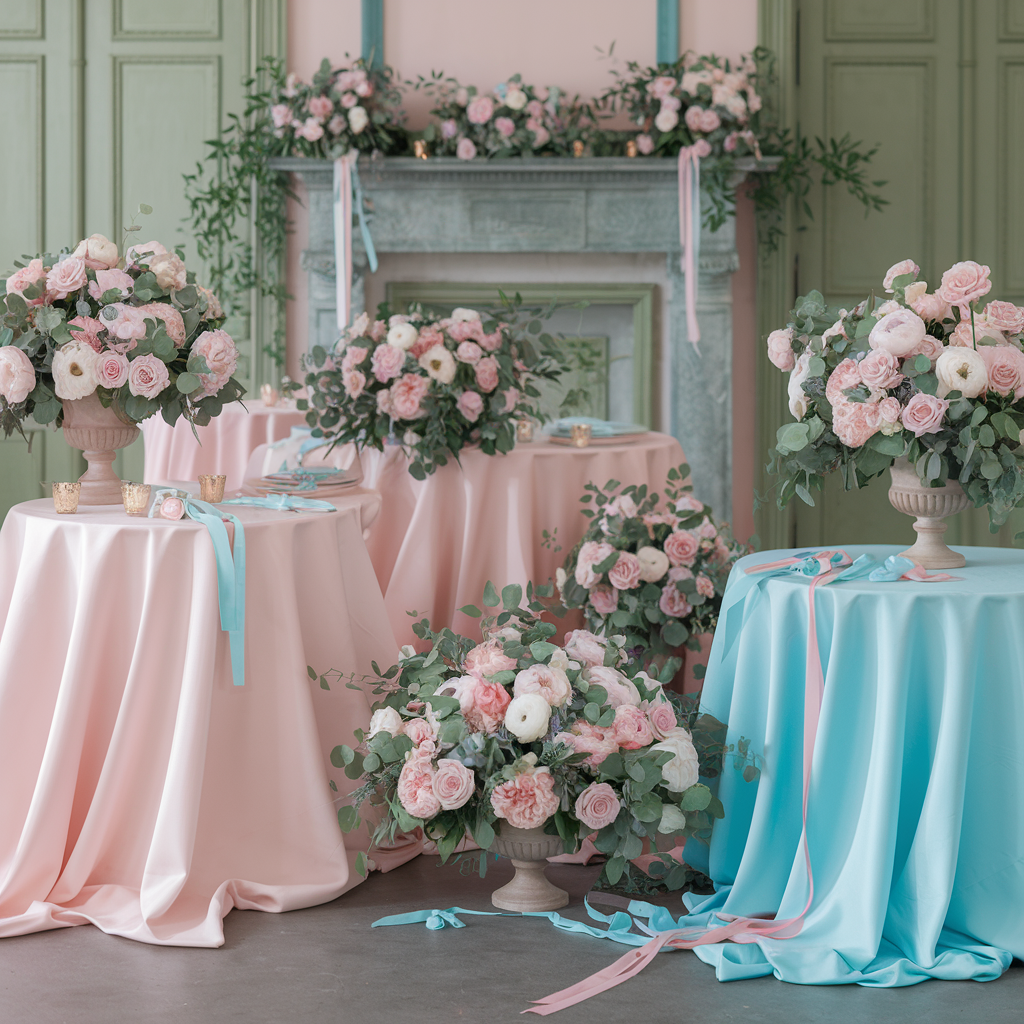
Flowers bring your colors to life. Talk to a florist about what’s in season.
Flowers can be used in:
- Table covers in our primary color.
- Napkins in our other primary color.
- Flowers that matched both.
- Colored glass vases.
- The color of the ribbon on the chairs matched with other colors.
Lighting changes colors too. Colored uplights can transform a room. Blue signifies calmness while red represents excitement.
Don’t forget about the cake. Ask the baker to match the colors perfectly. The inner part fabric or sponge too can be colored for a surprise during the cake-cutting.
Cultural and Regional Color Influences
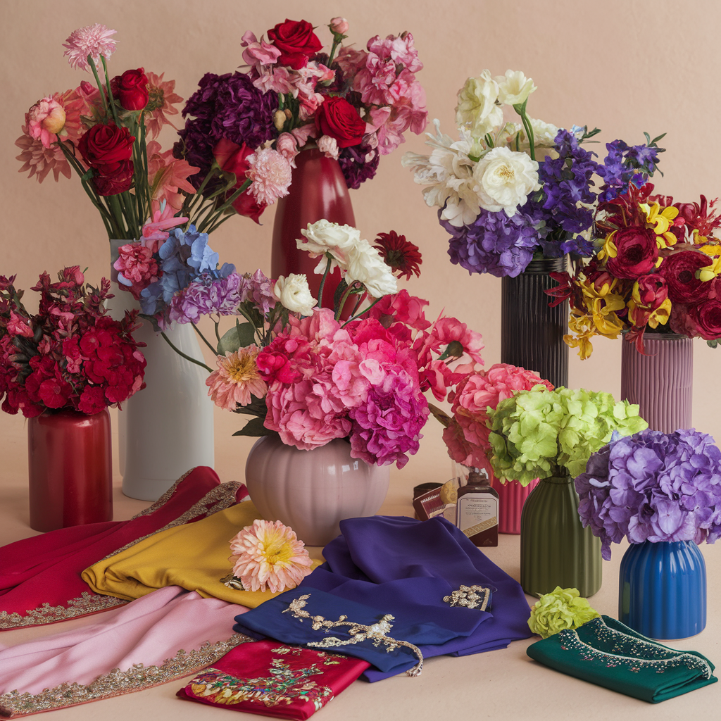
Colors have different meanings in cultures around the world. Things that may be considered lucky in one part of the world may be taken negatively in another.
How cultural traditions influence color choices
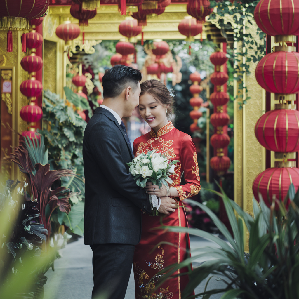
Many Asian cultures consider red as the star of weddings.
Chinese brides often wear a red dress because it symbolizes joy and good fortune. India believes it symbolizes something else: passion and fertility.
White isn’t always the go-to color everywhere. Japanese brides usually wear white kimono for the ceremony because it symbolizes purity. Some areas of Africa and India relate white to mourning.
Regional trends in wedding color schemes
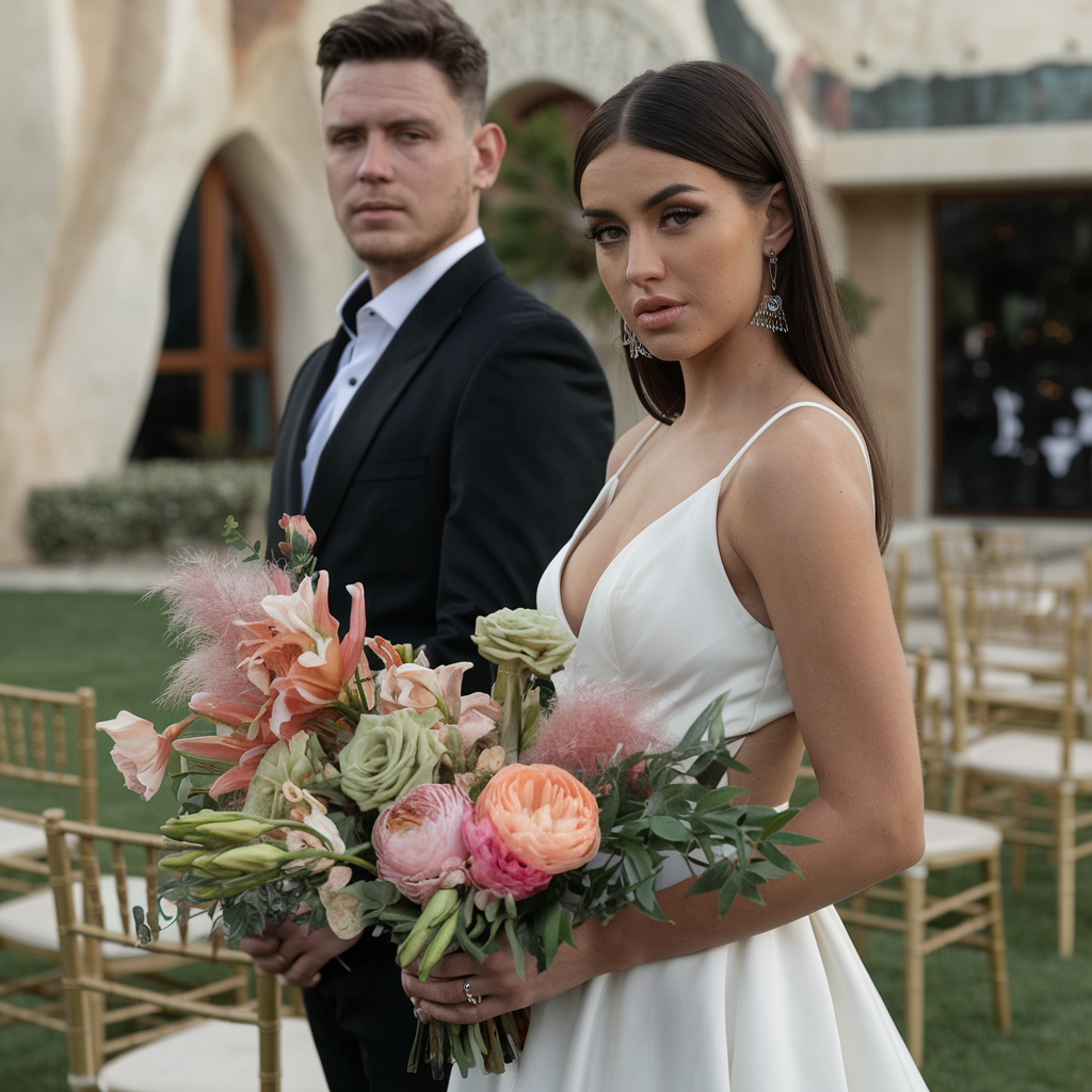
Living locality certainly influences the wedding color schemes most suitable for you. In the South soft pastels and neutral shades are popular year-round; perhaps due to the heat. Have a wedding with soft blush and sage green even if she was getting married in October.
If you can – try and meet the popular color palette in your area. On the West Coast? Many couples opt for bold colors inspired by the sunset like coral, terracotta, and gold.
Weddings on beaches have their own color trends. Blues, aquas, and sandy neutrals are often featured in these coastal weddings from Florida to California. A beach wedding can have a five-color blue palette that resembles the colors turquoise to navy more than sea to sky.
The best advice? Choose colors that feel right to you but maybe connect with grandma or your cultural elders before dismissing anything. The wedding should reflect your origins and traditions as well as your future.
Expert Tips for Perfect Color Coordination
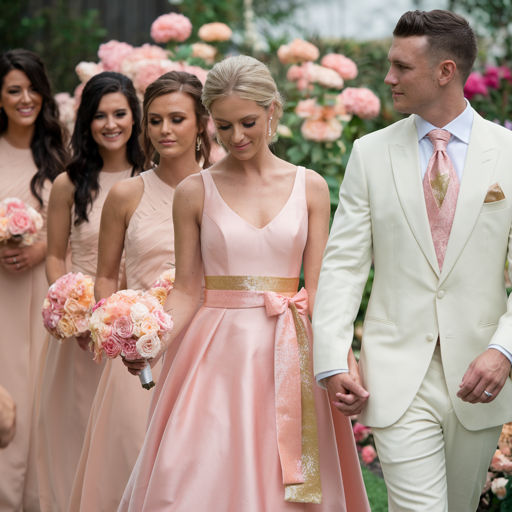
Many couples struggle with wedding colors as getting the right colors is hard but indeed makes a big difference. The advice is to choose colors that make sense and that show who you are as a couple
Start with this tip: Start with one main color you love. Then add 2-3 more colors that go well with it – this simple approach works best.
Look at the venue before picking colors. A green garden needs different colors than a beach wedding.
The venue is the backdrop for all your photos so make sure your colors fit the space and vibe.
Frequently Asked Questions (FAQ)
How can color affect my wedding photos?
Color choices impact how your photos look online. Vibrant colors photograph better in natural light while some venues require specific color palettes that complement their existing décor.
Can wedding colors reflect internet trends?
Couples should gather information from multiple sources before finalizing their color palette. Wedding providers offer different service capability speeds just as they provide various color options for invitations and flowers.
How do registry colors connect with wedding themes?
Target wedding registry colors should coordinate with your overall wedding color palette to create a cohesive link between the celebration and the future home. The color scheme on the invites should hint at what guests will see at the venue. Color choices should also reach all aspects of the wedding planning timeline.
What colors work best for wedding websites?
Wedding websites should use the same color palette as the paper invitations to create consistency across digital and physical elements. When designing your site consider color accessibility for all guests. The wedding website colors should work well on both cell phone plans and computers.

I am a free-spirited author with the focus of relationships, travel, mental health, and womanhood. I am still new to the writer scene but am excited for the journey that awaits.